Making significant interface changes when you have tens of thousands of active users is challenging, since the time it takes people to relearn the tool can hurt usage and also the business. Because we understood this was a necessary step for the software's growth and the product vision, we used risk-mitigation measures to ship it safely.
What drove the change in information architecture
The company's vision grew bolder, aiming to make the software the hub where solo lawyers and law firms organize and do all their work. That meant more people, more squads, and more features shipping. Without planning for that growth, the side menu kept getting fuller, with features hidden behind scrolling on some screen sizes — which directly hurt usage metrics for important features.
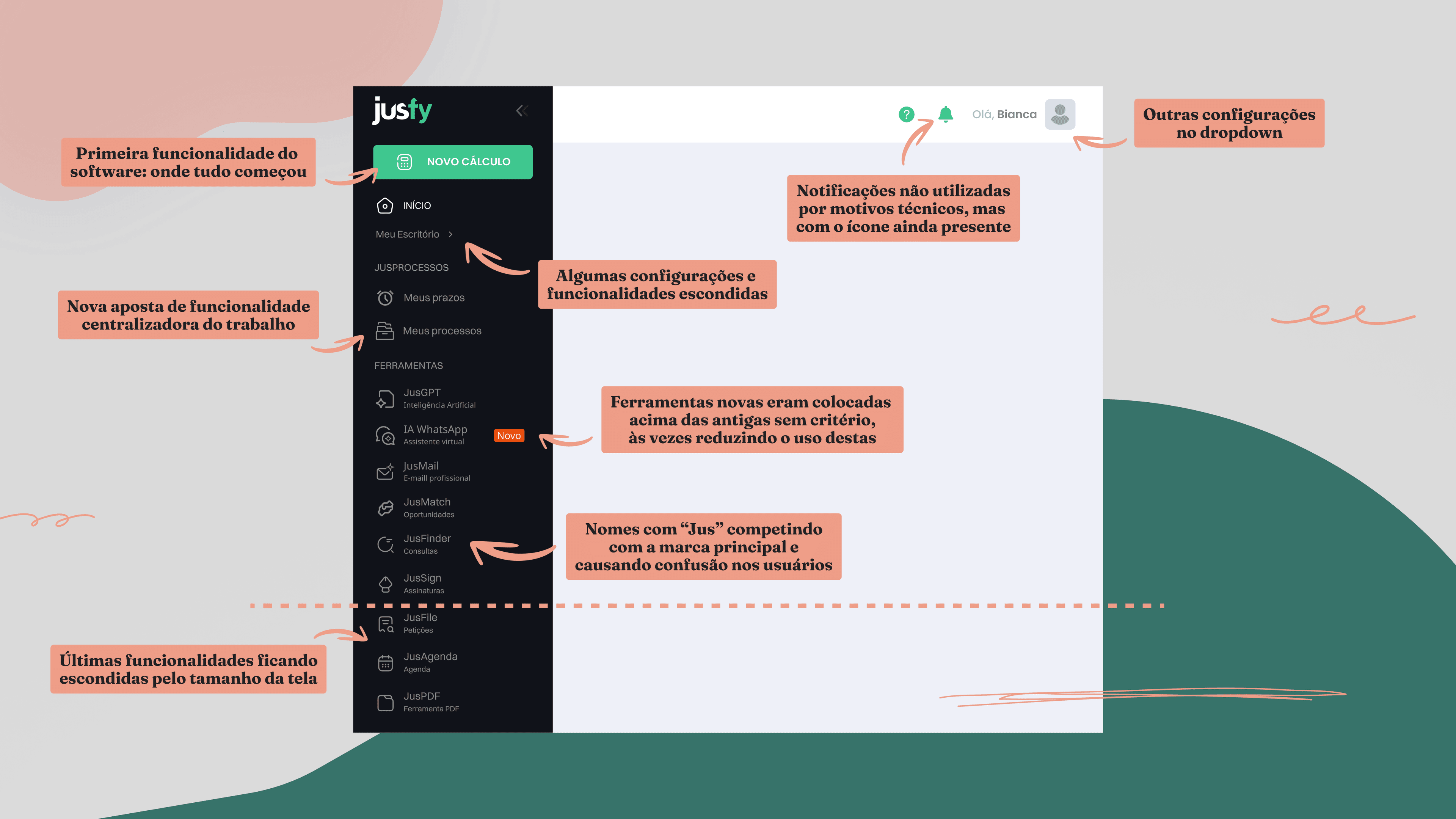
This negative impact lined up with a review of the software's design principles and visual identity, also driven by the company's new vision: trust and security, ease of use, quality, innovation, and approachability. Reviewing the information architecture and the menu would take the product to a new level of quality and positioning, with the potential to increase feature discovery and usage per user.
UI exploration and a usability test with mostly positive feedback
We used data from the persona research — like how tasks are divided within a law firm — to guide how features were organized in the new menu, along with the motivation to drop names starting with "Jus" from Justice, like JusFinder and JusFile (weren't terms that made sense to a good portion of Brazilian speakers). We created 4 different versions, discussed across 2 Design Critiques with Product Managers and Product Designers, weighing the organization suggestions and user experience each option provided.
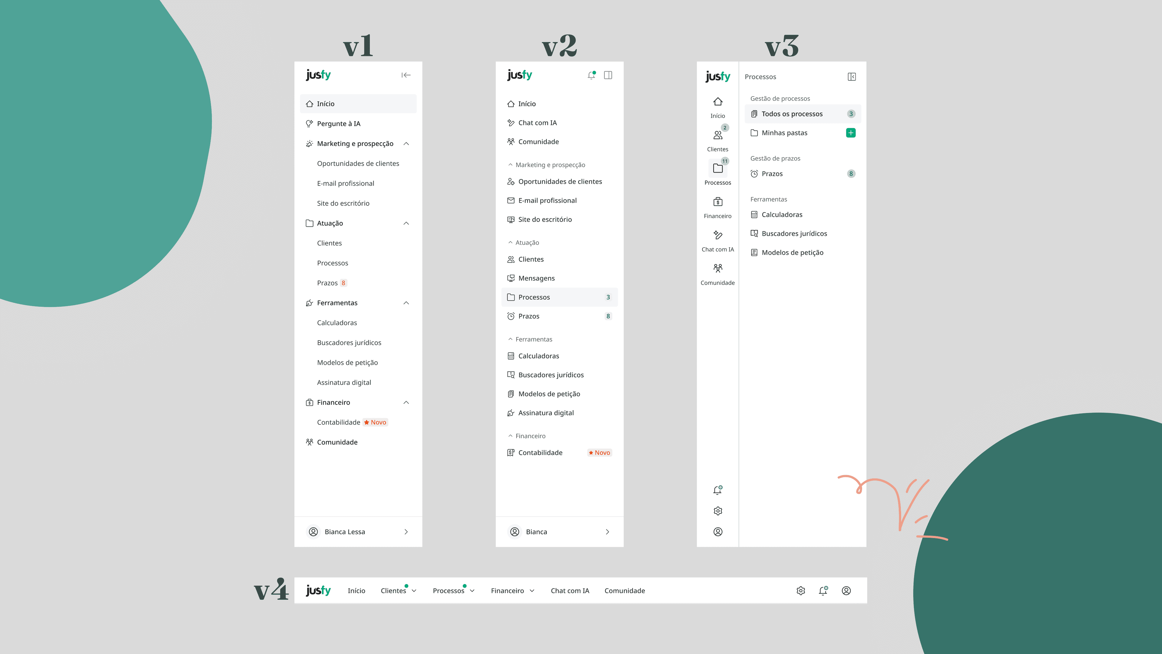
The version chosen to move forward to usability testing was the two-level side menu: it grouped features into categories that matched how lawyers think, allowed new items to be added within a simple logic, and helped spark curiosity about features close to the ones users already relied on.
While I worked on the menu, Product Designer Isabela Eckhard was testing changes to the product's home screen. She built a navigable prototype and ran an unmoderated usability test covering both the menu and the home screen.
We got good feedback on both changes tested: the new home screen and the new menu both scored above-average satisfaction, with mostly positive comments. It was clear we needed to pay closer attention to confusing naming — in one recording, the user had to open the Jusfy tab to remember what the "JusFinder" feature was called.
Progressive rollout and tracking through the CES survey
With positive usability test results and buy-in from senior leadership, the Journey Squad implemented the new menu and we rolled it out progressively to mitigate risk: first to new users, then to groups of existing users.
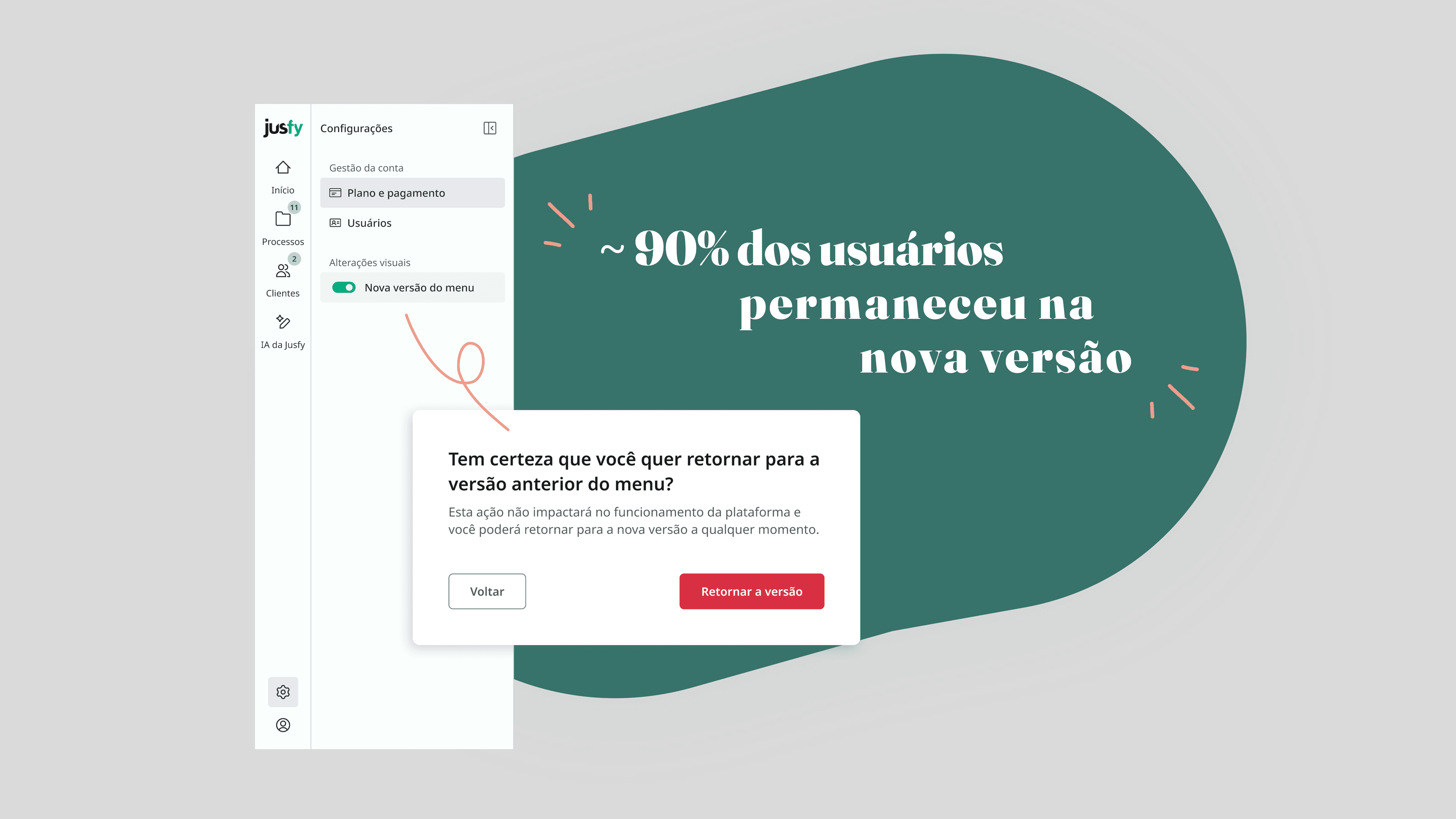
We tracked results daily — support tickets, quantitative and qualitative CES survey responses, and usage data for the menu, the platform, and the version rollback option — which gave us confidence that the rollout went smoothly, even though it changed how people navigated the product.
Next steps
For the new menu to be used to its full potential, each squad needs to implement a standard header and count badges on each of its features. We believe this can boost the menu's usage.
We're also going to build a notification center — leveraging both the new menu and the upcoming app launch — aimed at moving usage metrics like stickiness, which didn't improve from the menu change alone.